Reimagining ways to visualize biological protein pathways
— Ted Dillon, Managing Producer at Captains of IndustryWe came to Pavan with an complex, abstract problem: we needed a team member to help us develop an interactive data visualization to represent complex biology concepts while highlighting our client's product offering. Pavan's versatile knowledge surrounding data visualization was invaluable in creating a scientifically accurate visualization that was easy to understand and looked great. The visualization gave excellent exposure to our client's product line. Pavan is a great engineer, thinker, and communicator -- we'd hire him again in a heartbeat!
Cell Signaling Technology (CST) is an industry leader in developing and producing antibodies and regents used to study the cell signaling pathways that impact human health. They maintain an in-house biology research program, and focus on cancer research.
CST wanted to reimagine the way to understand and discover the various biological protein pathways present in all of our bodies. We partnered with Captains of Industry to develop a modern, interactive, and scientifically accurate visualization.
The intended audience for this visualization was Very Smart Scientists™, so we had to ensure scientific accuracy in everything we came up with. We made sure to keep in constant contact with their scientists and researchers to have them validate all of our decisions and designs. What we ended up with was a clean, simple, and interactive take on the dated scientific diagrams that existed to visualize protein pathways.
Data & Research
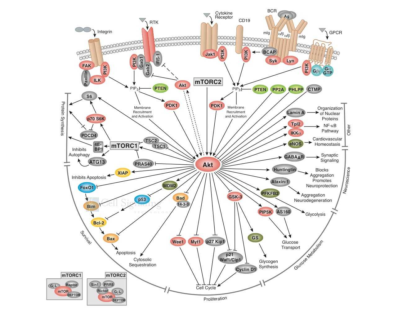
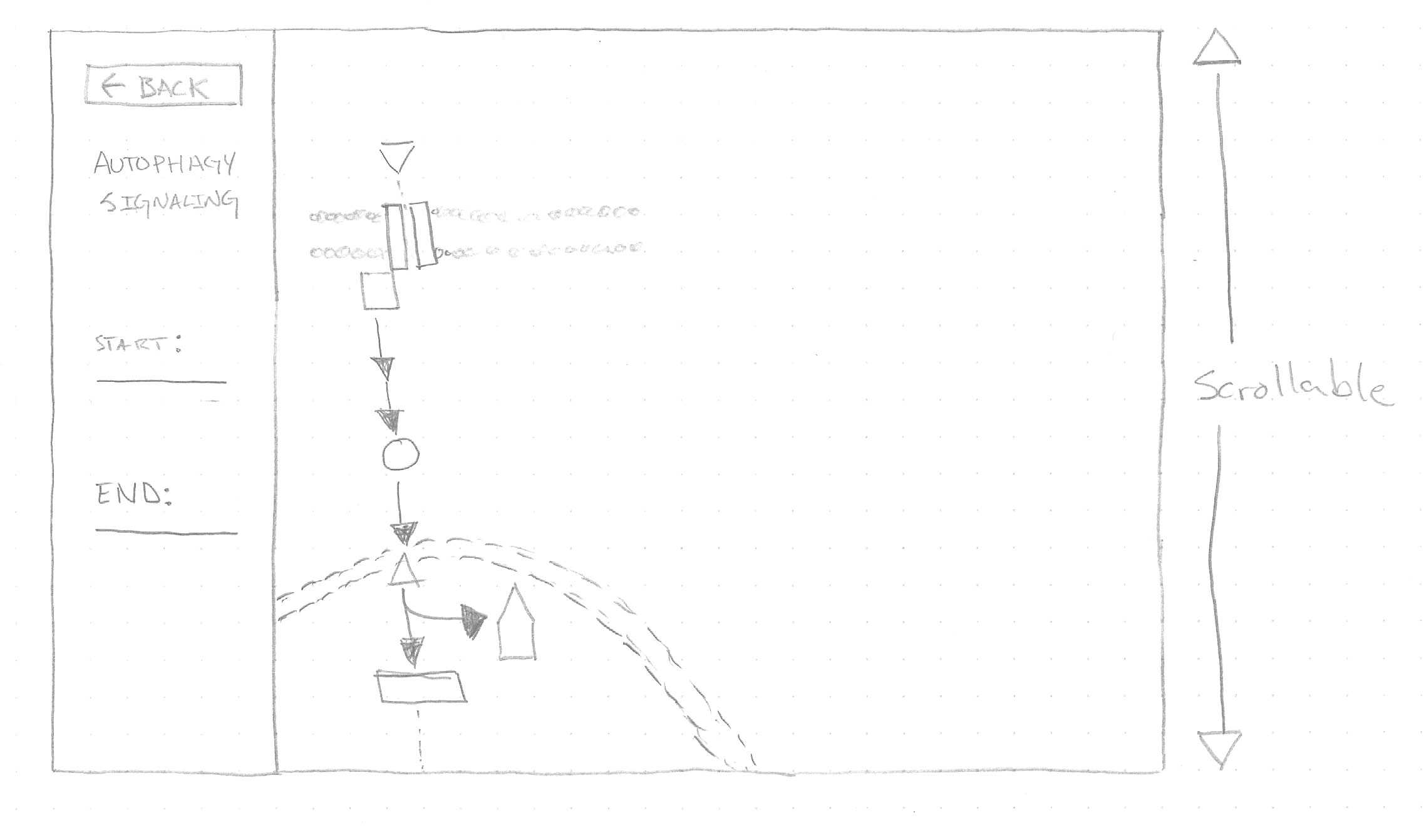
Our first step in designing this visualization was to learn. We researched as much as we could about protein pathways so that we could provide accurate suggestions on how to develop this visualization. This was what they gave us as an example of how things were visualized in the past:
They also provided us with a large data set of Protein Pathways that they wanted to visualize. This came in the form of multiple complex spreadsheets.
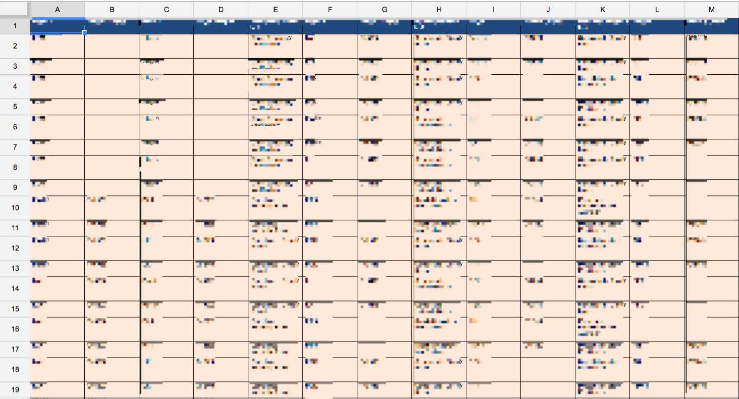
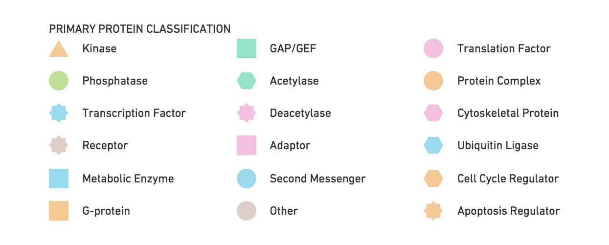
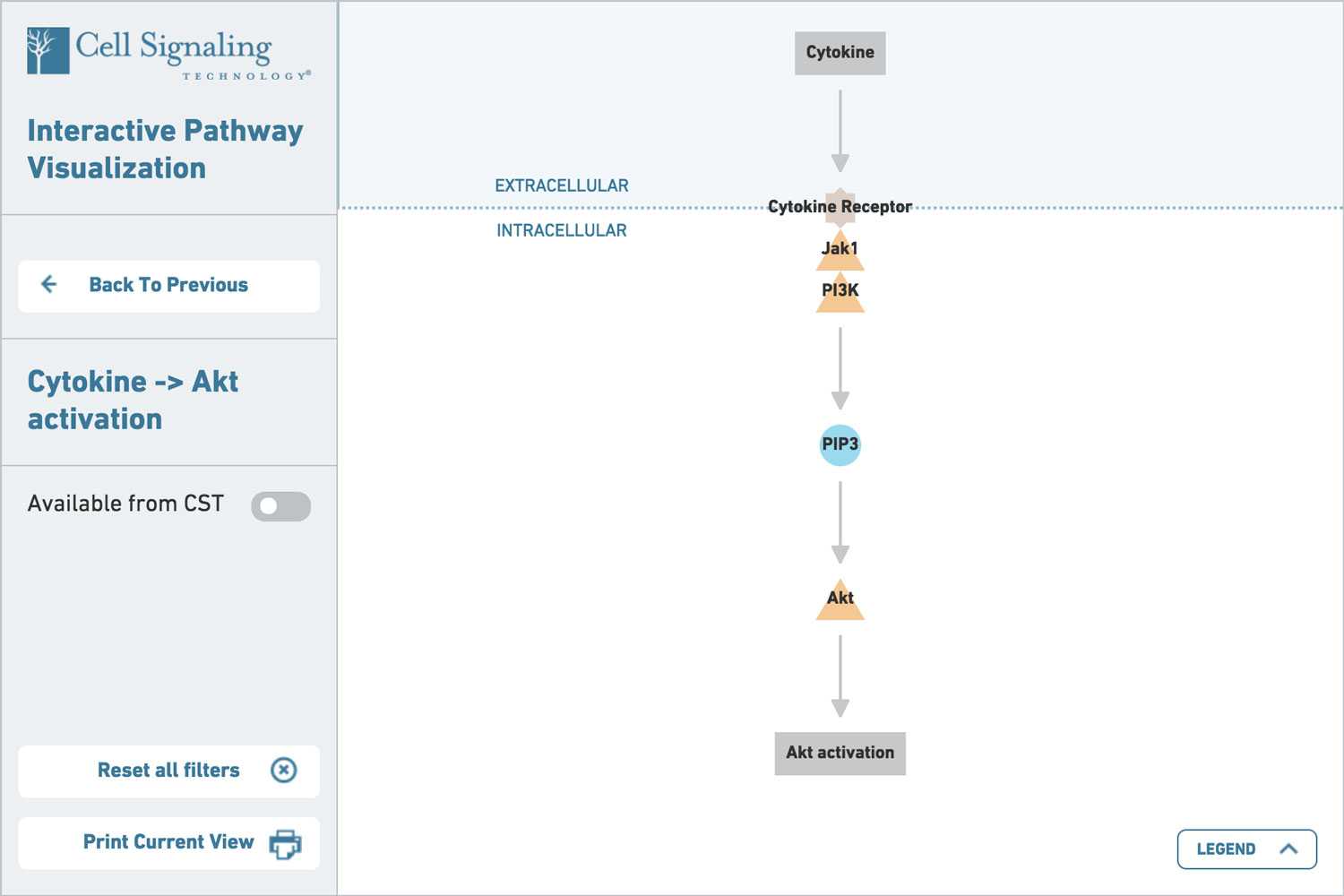
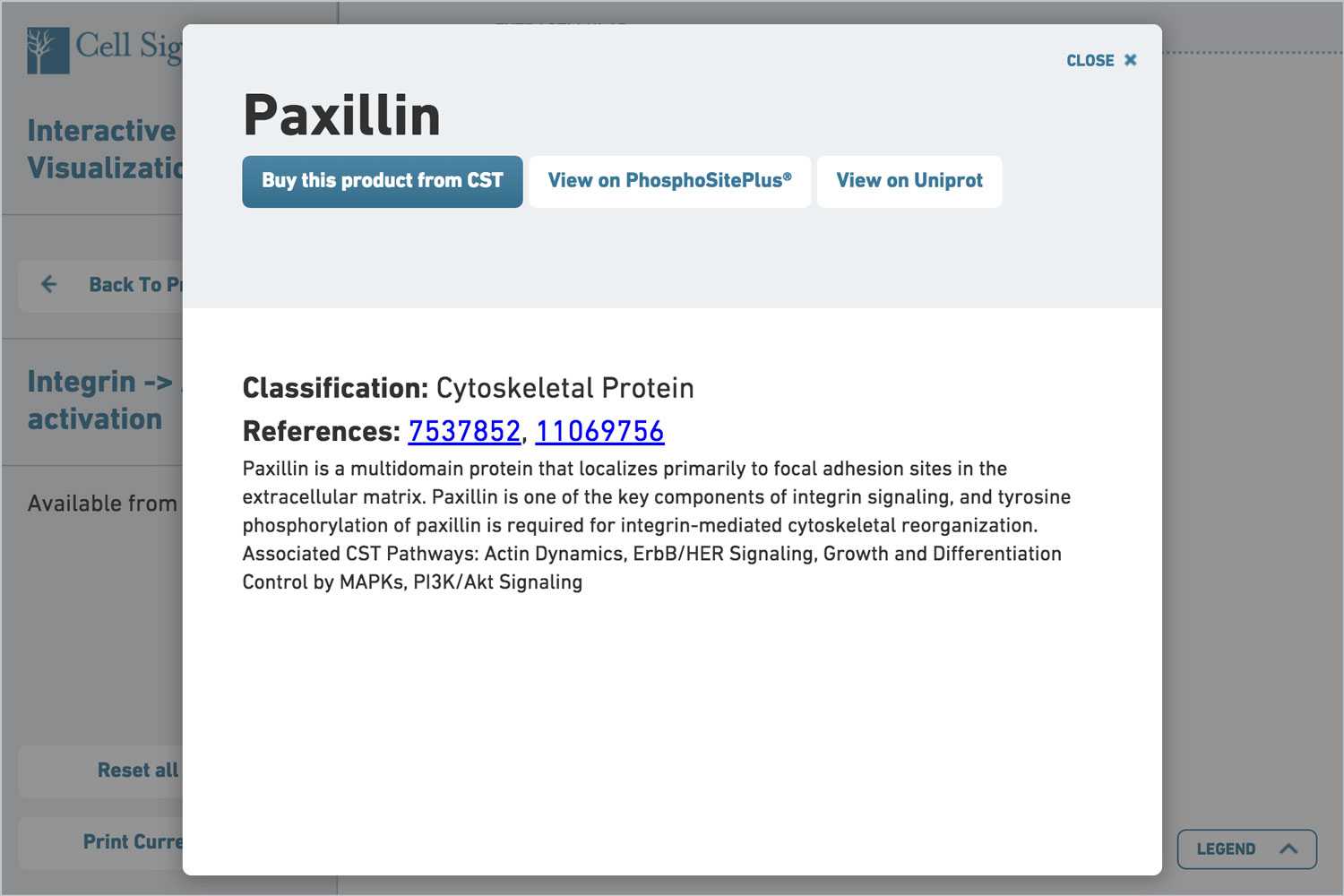
We took this spreadsheet, wrangled the data, understood all the protein types, and developed a new taxonomy and information architecture to display the various types of proteins. Every step of the way, we validated our designs with CST's scientific team. Eventually, we used a combination of shapes and colors to create a more modern taxonomy:

Design & Engineering
Once we had our information down, we set to designing the visualization itself. We made flowcharts, sketches, and storyboards to understand a user's flow, and the pathway display itself.
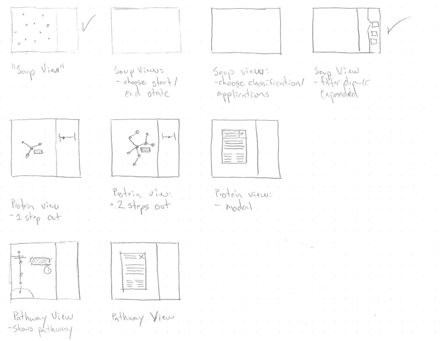
One of the key elements we focused on was the ability to zoom in to an individual pathway itself.
In the end, we ended up with a simple and interactive way to explore the various protein pathways related to the products that CST offered.
CST debuted the visualization at an annual conference, and we're told it was the most popular item in their booth ;).
Related Work

Designing and building an open-source platform from the ground up
- UX & Design
- Front-End
- Back-End
- Product Strategy
- React
- Rails
- ElasticSearch

Visualizing Wootric's massive data set
- Front-End
- Back-End
- Data Visualization
- Angular
- Rails
- D3